ANQA Website
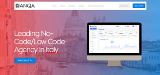
Anqa is a digital marketing agency offering multilingual services to a global clientele. Its website serves as the primary touchpoint for clients to explore services, view the portfolio, and understand pricing. While the existing website provided essential functionality, it suffered from usability, design inconsistencies, and cluttered navigation.
Problem Statement
The existing website faced several issues:
Inefficient navigation and underutilized components.
Confusing user journeys with duplicate buttons and inconsistent elements.
Inadequate support for multilingual users.
Design inconsistencies affecting the visual appeal and usability.

Research and Insights
Approach:
User Interviews: Conducted interviews with existing clients and team members to understand pain points and expectations.
Competitive Analysis: Reviewed websites of top digital marketing agencies to identify industry standards and best practices.
Analytics Review: Analyzed website traffic patterns to determine areas of user drop-off and underutilized sections.
User Research
Key Findings:
Users struggled to navigate between languages.
Overlapping calls-to-action (CTAs) created confusion.
Inconsistent design elements diminished brand credibility.
Users preferred a clear, cohesive design with streamlined navigation.
Problem Identification & Solutions
1- Navigation and Menu Box
Issue: An underutilized menu box caused navigation confusion.
2- Language Options
Issue: No visible language selection feature.
3- Duplicate "Get in Touch" Buttons
4- Photos Section
Issue: Text overlays cluttered the visuals, and multiple CTAs overwhelmed users.
Design Process
Issue: Two identical buttons on the homepage led to user confusion.
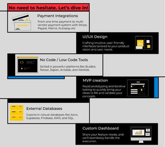
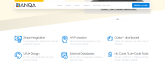
5- No Code/Low Code Page
Issue: Overlap with the homepage created confusion.
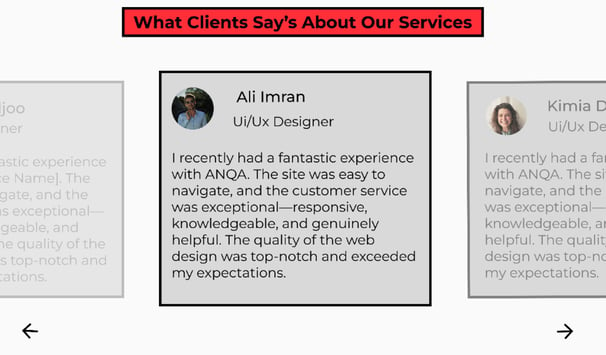
6- Comment Section
Issue: Uneven comment box sizes disrupted the layout.
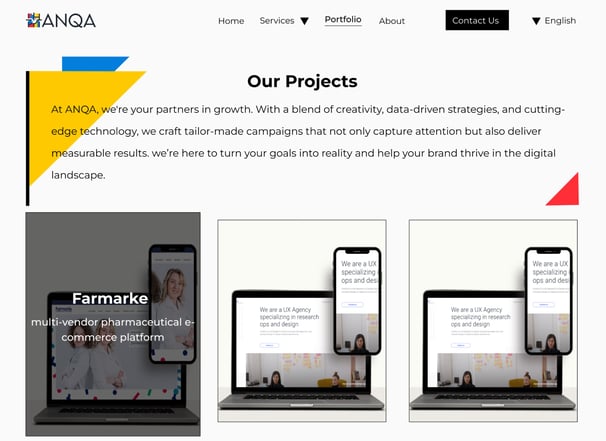
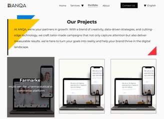
7- Project Page Color Inconsistency
Issue: A red color scheme clashed with the rest of the website in projects page.
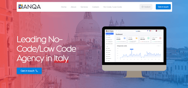


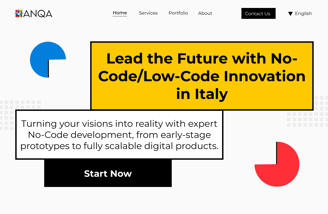



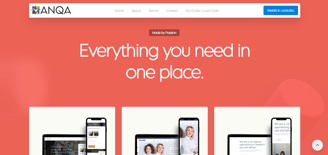
Before
After
Solution: Removed the menu box. Introduced a visual cue with a color change to indicate the current page.
Solution: Added a language dropdown to the toolbar, allowing easy switching between English, Italian, and German.
Solution: Retained the persistent toolbar button and replaced the second button with a "See More" option linking to the services page.
Solution: Removed text overlays. Focused on high-quality visuals with explanatory text alongside. Unified the CTAs into a single "Learn More" button.
Solution: Consolidated sections into the homepage.
Solution: Standardized the dimensions of all comment boxes for a uniform appearance.


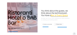
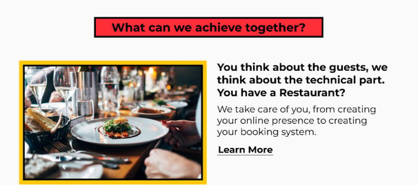

Solution: Unified the color scheme across all pages for a cohesive visual experience.
Before
After
Before
After
Before
After
After
Before
Results
35% increase in user engagement as measured by time spent on the website.
50% decrease in bounce rates on critical pages (Homepage and Portfolio).
Improved navigation efficiency, reducing clicks to key sections by 25%.
The redesign successfully transformed Anqa’s website into a user-friendly, visually appealing, and functional platform. The new design aligns with the brand’s goals, enhances user experience, and supports business growth.
Want to work together?
Feel free to reach out for collaborations or just a friendly hello
kimiya.dadjoo78@gmail.com